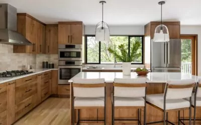
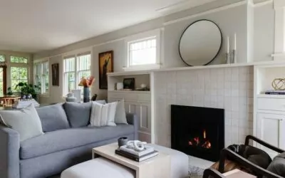
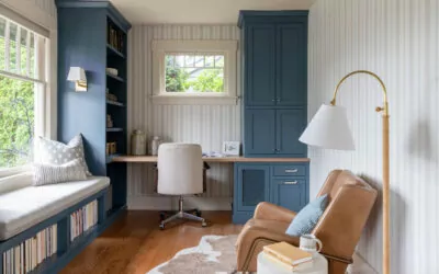
I’m going to let you in on a little secret. But shhh, don’t tell anyone 😉 You want to know what it is? It’s the secret sauce you need to have a show-stopping home! You know, one of those spaces your guest walks into and goes “WOW!” Not a lot of people can specifically point out what makes them swoon over a room, and that’s because it’s not just one thing. It’s many elements working together to create a cohesive design that carries your eye and keeps you interested. But I promise it’s not as daunting as it sounds – it’s actually pretty easy once you know what you are looking for! Ok so now that you know the reason WHY a thoughtfully designed room looks so good, let’s get to the HOW. I’ve listed the principles and elements of a well curated room below to give you the tools you need to design that dream home of yours!
The Principles of Design
Scale – this refers to the size of the room as well as the objects within it. You want to make sure your sofa isn’t too large for your living room, your dining table isn’t too small for the dining room, your nightstands next to your bed are too small, and so on. The scale of objects within a room need to be proportional to the constraints of the space as well as the objects around it. This leads me to the next principle!
Proportion – as I stated above, the size of objects needs to be proportionate with one another. Meaning that the scale of the armchairs should complement the size of the sofa. This can mean being larger or smaller, but not TOO big or TOO small so as to confuse the person in the space. Variety is always key here. Having certain pieces larger or smaller than one another can create balance…
Balance – balance doesn’t mean making sure everything is the same weight. Think more about balance VISUALLY. You can achieve this by arranging objects symmetrically, asymmetrically, or radially. Take a look at the decor on a coffee table for instance. If you have a vase and flowers that are taller, to balance it out you may stack a couple books next to the vase and add a candle or object on top of the books to help visually balance out the vase and flowers. Same goes for furniture and other accessories. If you have an armchair and floor lamp on one side of the room you may add a tall indoor plant on the other side to accomplish visual balance. Balance can be a bit tricky and may take more of a trained eye to see, but don’t give up! Keep playing around with the orientation of things until it looks right to YOU! Sometimes having something “off balance” may just be the perfect visual balance!
Rhythm – this is the flow of elements, usually organized according to a scheme such as repetition, alternation, gradation, contrast, or radiation. Rhythm is what continually carries the eye throughout a space in a pleasing way. This can be accomplished with color, pattern, texture, lines, scale, etc. An example of this is if you look at a living room as a whole and can immediately notice the color scheme. Say you see white, coral, and navy. Maybe the couch is navy and the curtains behind it have a pattern including navy. The pillows are white and coral which tie in with the colors of the rug and walls. See what I’m getting at here? Rhythm is achieved through the repetition of color.
Emphasis (Focal Point) – every well-designed space has a focal point, where your eye immediately gravitates toward. This could be a colorful painting above your fireplace, the backsplash in your kitchen, or large picture windows highlighting the view. You can have multiple focal points, each with a different level of emphasis that carry your eye throughout. But make sure there isn’t too much conflict. Having too much stand out makes the space too loud and intimidating.
Harmony (Variety & Unity) – this is the compatibility of elements creating a pleasing whole, achieved through variety and unity. It is a delicate balance between the two but when both are in agreement, the space will feel right. You will accomplish variety and unity by building off the prior principles I’ve told you about. As long as you create a room that has scale, proportion, balance, rhythm, and emphasis, you will find variety and unity naturally.
All of these concepts above wouldn’t be anything without their quantifiable counterparts, the elements of design. In order to achieve anything I talked about above, you’ll need to know the pieces that embody the principles of design and transform the theory into a reality. I have listed those elements and their definitions below.
The Elements of Design
Space: open and closed areas, positive (filled) or negative (open) space
Shape: two-dimensional, outline, often seen as a geometric figure such as a rectangle
Form: three-dimensional shape, such as a cube, cone, or sphere
Mass: weight, density, or solid form; can be actual or visual
Line: connection between two points, lines may be horizontal, vertical, angular, or curved
Texture: smoothness or roughness of a surface; may be read visually or through touch
Pattern: arrangement of motifs in a repetitive or variegated order
Light: natural, artificial, or combination of both types of light
Color: hues that vary from light to dark, saturated to unsaturated, intense to dull
The elements you see above are naturally achieved through the furniture pieces, lighting fixtures, accessories, wall treatments, window treatments, wall art, hard surfaces, and finishes installed in your home. For instance, you may select a sofa that exhibits clean LINES, an organic SHAPE, a soft TEXTURE, and a bold PATTERN. The large windows you install in your kitchen produce a lot of natural LIGHT. The open hallways and wide staircases create a lot of SPACE. I could go on and on, but do you see my point? Hopefully, you have a better sense of the theories behind a well-designed room and can apply these to curate your dream home!


