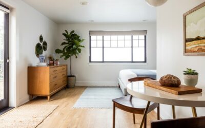
What will the space be used for?
First, ask yourself what the space will be used for. Is it a living room where you’ll be doing a lot of entertaining? A family room where you’ll mostly be getting cozy to watch movies? A mix of both? It’s important to take a step back and decide what your goal are for the space. This will set the scene and make the next steps much easier.
Choose a focal point
Every room has a focal point. The desk in an office, art above a fireplace, large windows capturing a breath-taking view, a funky shaped sofa or colorful piece of art – its up to you! Sometimes the focal point can be naturally built into a space (think fireplace or large windows), but for the most part you can decide where you want someone’s eyes to gravitate to when they walk into a room. Once your focal point is chosen, you’ll want to arrange your furniture around it as much as possible.
Conversational areas
Revert back to the first question I had you ask yourself, what will the space be used for? Once that is established think about the conversational areas that will happen in your space. Is your space large enough to allow a couple different seating areas? Maybe a nook for 2 side chairs and an end table for those that like to have a more intimate conversation? Is it a dining room where everyone is seated around one large table? Do you want to have cozy conversations near the fireplace? How much seating do you want? It’s important to walk through this in your mind because having this mapped out will help drive the placement of your furniture.
Avoid walls
It is very common to automatically put furniture against walls – but resist this urge with all your might! Yes, sometimes the wall is the best place to put the sofa in the end, but make sure you play around a bit and see if there isn’t another configuration that would work. Even in small spaces, you gotta give your furniture and walls a little bit of breathing room so leave a few inches. The larger the space, the easier it is to place your furniture away from the walls. For example, if you have a living room with a fireplace centered on the wall, orient the sofa to be floating in the middle of the space and centered with the fireplace. Or if you have two larger sofas have them face one another while perpendicular to the fireplace. Place a coffee a table in between them and voila!
Consider the flow of traffic
Your space’s functionality is directly determined by how well someone can navigate through the space. If you or your guests can’t walk around the sofa to get to a side chair, or have to make a bunch of zig-zag turns in order to get out of the space than something needs to change. Look at your space and where people enter/exit from. You want to have a clear, defining path that is obvious to the occupant. You also want to make sure your furniture isn’t too spaced out or crunched together. For instance, a good rule of thumb is to have your coffee table about 12-18” away from furniture so there is enough space for someone to walk in between but also still reachable for setting a drink down.
It’s all about balance
At the end of the day, you want your space to look aesthetically pleasing. Achieving balance is an important element that’s not always obvious but is there. When a space is well balanced, it’s not like you automatically notice and think “this space is well balanced!”. It’s more often you’ll notice something is off balance because that will be a lot more obvious. In design, balance isn’t necessarily making sure you have a chair on each side of the sofa, it’s making sure that there is equal “weight” on either side, if you will. For example, putting a side table with a lamp on one side of the sofa and a floor lamp on the other achieve balance. The pieces do not technically weigh the same or look the same, but the scale of the tall lamp compared with the stacked side table and table lamp equal each other out. You want your furniture layout to follow suit. It needs to feel balanced within the space. If you follow the steps leading up this, you will unintentionally create balance.
Don’t forget lighting!
Lighting is the last piece to the space planning puzzle. Once you have your furniture layout set, think about where you want to add ambient or task lighting. Do you intend to have a arm chair meant for reading? Add a floor lamp behind it. Side table next to the sofa? Add a lamp. Having a fun pendant dangling from the ceiling add interest to a space too. Ultimately, you want to make sure your space has enough light scattered throughout the space so you don’t have any dark spots or corners. Ceiling can lights are a great, concealed way to achieve this.
Want to know more? Leave comments or suggestions in the section below! We would love to hear from you!


